Cartography basics
Elements of effective communication
Maps are media with which we communicate our conceptions of spatial relationships. In order to create an effective map we have to understand what it means to be an effective communicator. Having a clear idea of the map’s message is essential. Before you can decide how to say something you need to know what you want to say.
- What is your message?
- Who are you talking to?
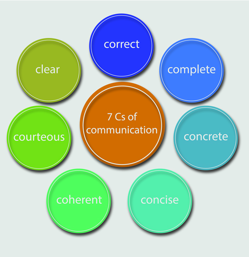
Figure 1: https://www.open.edu/openlearn
Elements of design
Maps are visual representations of often complex ideas and relationships. The elements of design are the tools at your disposal for effective visual communication. While the interpretation of language is linear—in the case of English it happens from left to right and from top to bottom—visual interpretation does not have a prescribed order. Using design, you must guide the viewer through the map so that they interpret the map’s meaning in the way that you intend.
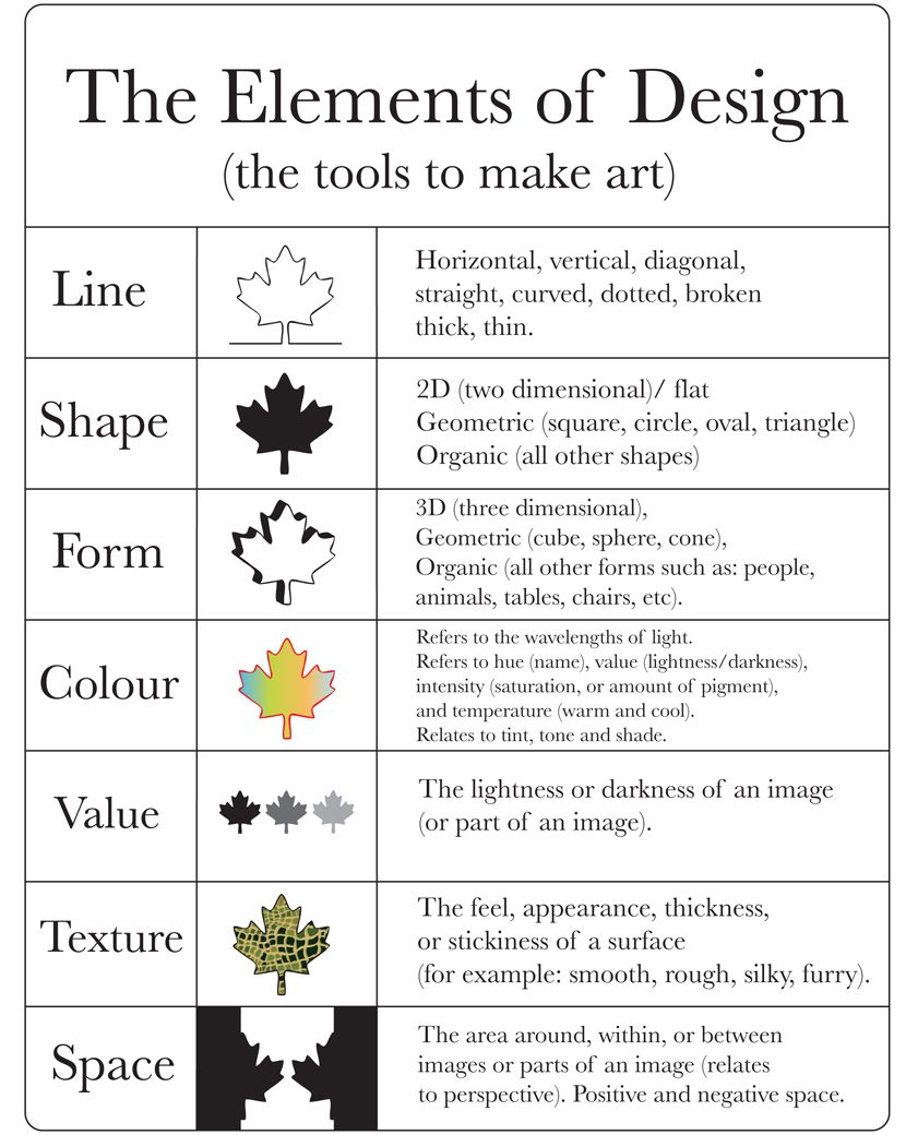
Figure 2: https://splitcomplementary.blogspot.com/
Principles of design
The principles of design are the ways that you can use the elements of design. These are the ways that you will vary the elements in order to convey the message of your map.
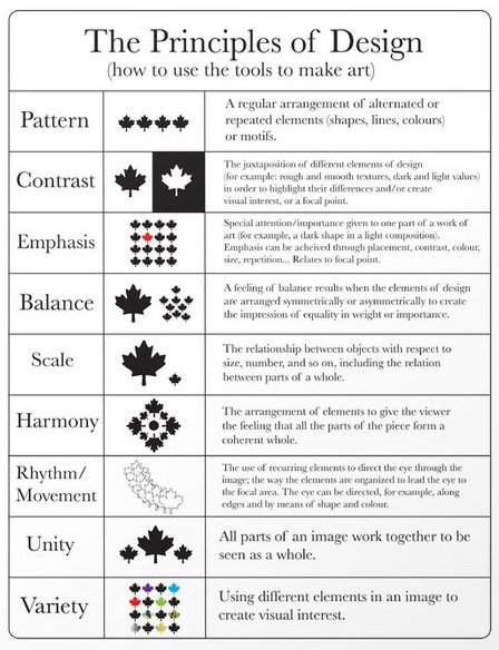
Figure 3: https://splitcomplementary.blogspot.com/
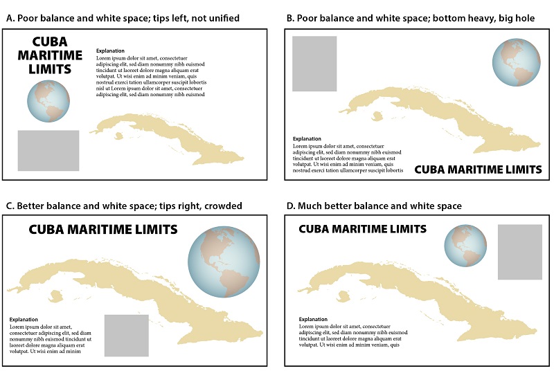
Elements of a map
Most maps have many elements in common. While not all maps need to contain all the elements, they all require some. Map elements provide information essential to the interpretation of the map. All maps should be able to stand on their own, meaning that a viewer requires no additional information to understand the map than is available on the map itself. If someone found your map on the ground would they know what it meant?
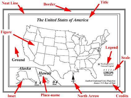
Figure 4: https://djjr-courses.wikidot.com/
Basics of a good map
In no particular order, here are some tips for making an effective, attractive, and honest map:
Have an informative title. If your map shows all the counties in Texas that are predominately Democratic, don’t name it ‘Map of Texas’. Name it ‘Predominantly Democratic Texas Counties’!
Your legend does not need to be titled ‘Legend’. If you are showing Democratic counties in blue and Republican counties in red, your legend might be named ‘Political party affiliation’. Often, the legend does not require a title at all.
Make sure that the legend entries have informative names. Seeing ‘tx_counties_dem’ looks sloppy and may be confusing. Rename layers in the Table of Contents so that there is no ambiguity.
Make full use of the space on the page. While you don’t want your map to be crowded, there is no reason to leave excesive white space around the map figure. Zooming in on the data of interest is often a good place to start.
Experiment with different arrangements of your map elements. Not only should they fit well together, there is an information hierarchy that should be visually enforced. The title and the data you want to emphasize are the most important; they should stand out!
You can also change the page layout to be either landscape or portrait. Depending on the shape of your area of interest, one may be more appropriate.
Make sure that your data is visible. If you are mapping points that represent all the schools in a Texas city, don’t make the points so large that you can’t make out their location. Likewise, don’t make them so small that they are difficult to see.
Scale bars are adjustable. You can change the number of subdivisions as well as the units. Make them simple and legible! They should be easy to use. Also, depending on the map projection (if it does not preserve distance) and the purpose of the map, a scale bar may not be needed.
Likewise, a north arrow is not always needed. If the map projection does not preserve direction, a north arrow is innappropriate as north varies over the map.
It is a good practice to include the source of your data on the map. The text should be small and unobtrusive but it is important that you be transparent and show that your message is trustworthy.
CHECK YOUR SPELLING
Before you export your map as an image, make sure to clear any selections you have map. Selected features in a GIS are highlighted—this will show up in your final map document and potentially distract from your message.
As we move forward by learning about different kinds of maps there will be many more things to add to this list. However, these are basic principles that apply to every map that you will make.
Examples
These are examples of a basic GIS map. The primary purpose of this kind of map to is to relay information; however, maps must be readable to get their point across!
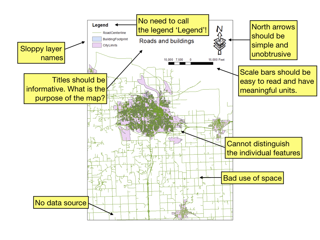
Figure 6: A bad GIS map
This map (Fig. 6) is very bad. Almost unreadable and definitely untrustworthy. What is it even about?
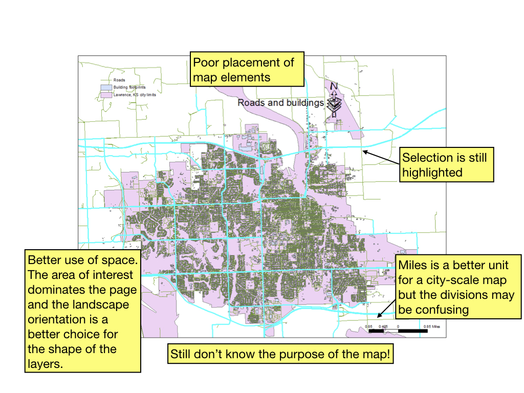
Figure 7: A better (but still bad!) GIS map
This map (Fig. 7) is better but still not great. We still don’t know what the point is.
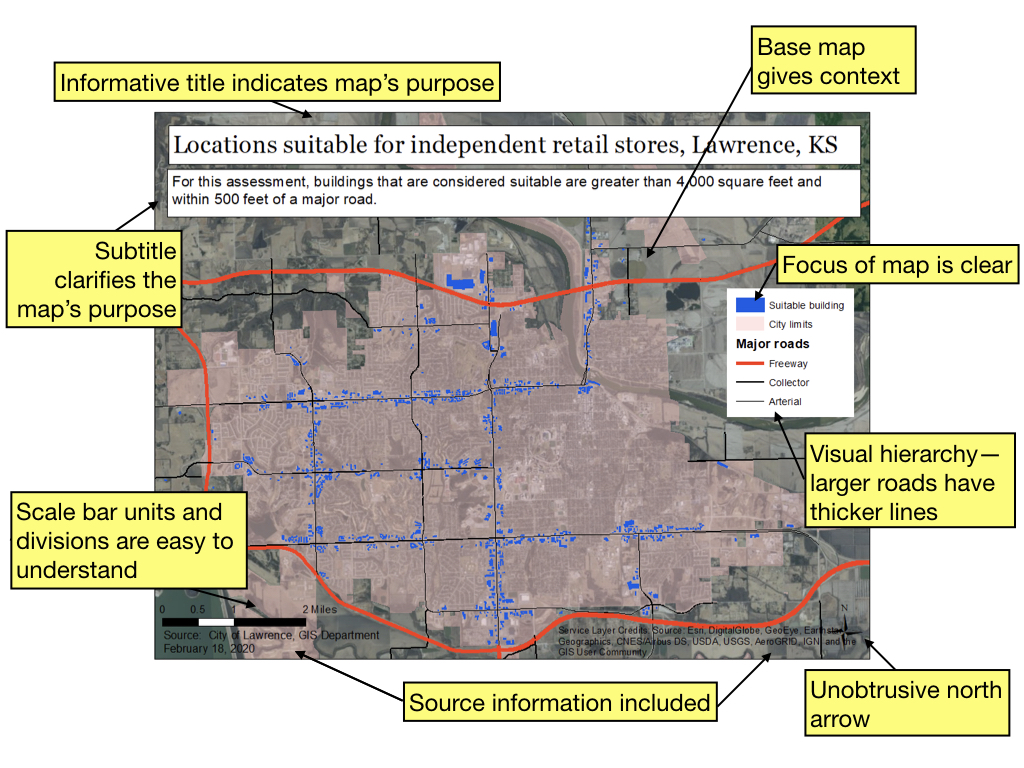
Figure 8: A pretty good GIS map
This map (Fig. 8) could certainly be improved but includes all the elements necessary to interpret it. If you found this map on the ground, it is reasonable to assume you be able to find a suitable space for your bookstore!
A few good resources
Again, in no particular order, are some online resources that may be helpful in developing your cartographic skill. Just like public figures employ speach writers to ensure that their message resonates, mapmakers need to employ cartographic skills to ensure that their message is properly interpreted. A quality map is not only informative but also beautiful and inspiring!
Finally, a couple of my all-time favorite maps
Although these are not the kind of informational maps that are usually map in a GIS, they certainly illustrate the possibilities of cartography!
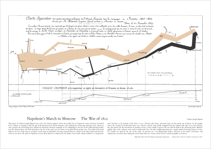
Figure 9: Napolean’s March to Moscow, Charles Joseph Minard, 1869, https://www.edwardtufte.com/tufte/
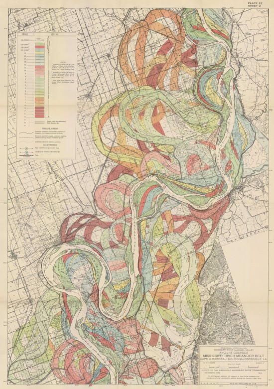
Figure 10: The alluvial valley of the lower Mississippi River, Harold Fisk, 1944, http://www.radicalcartography.net/index.html?fisk